QUARTER TO PIZZA
branding
visual identity
packaging design
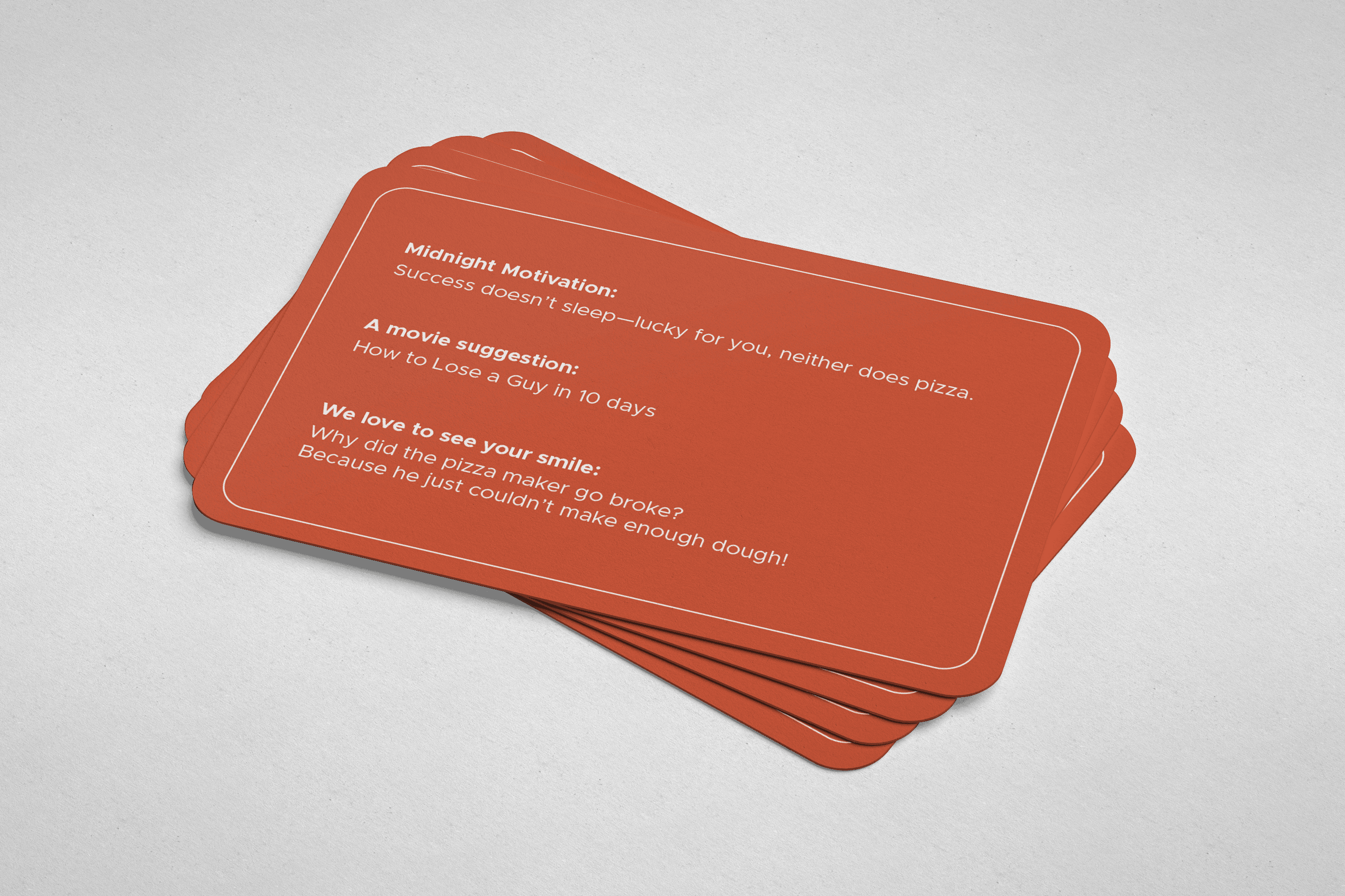
When the city sleeps, we're wide awake. Quarter to Pizza is your after-hours lifeline, the cloud kitchen that never closes when hunger strikes at 2 AM. We get it – life doesn't stop at 9 PM, and neither do those late-night cravings.
Whether you're pulling an all-nighter at the office, stumbling home after a night out, or three hours deep into a movie marathon, we're here for those moments when you need the perfect slice and an ice-cold drink delivered straight to your door.
Team Members
N/A
Role
Brand Identity
Packaging Design
Duration
1 week
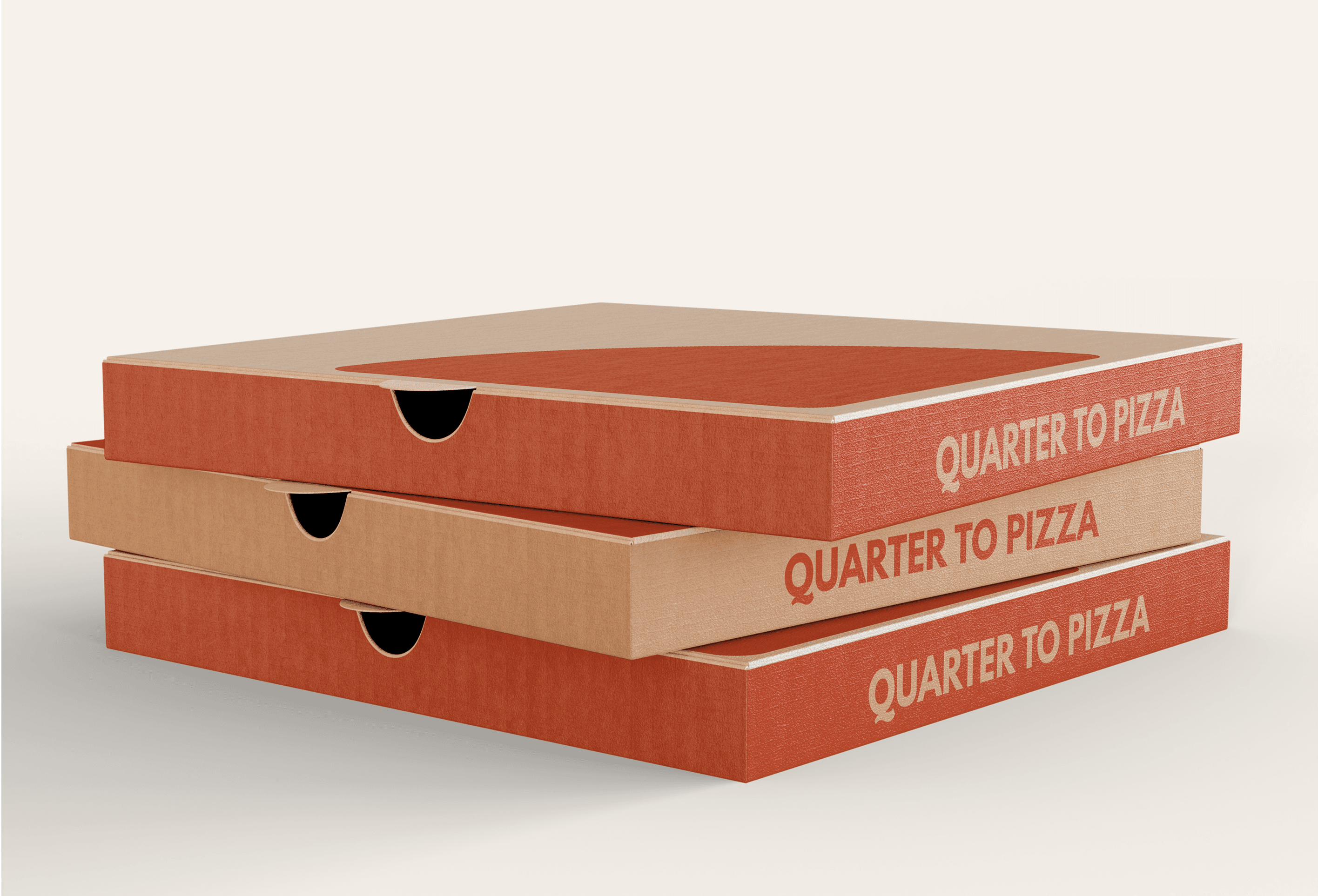


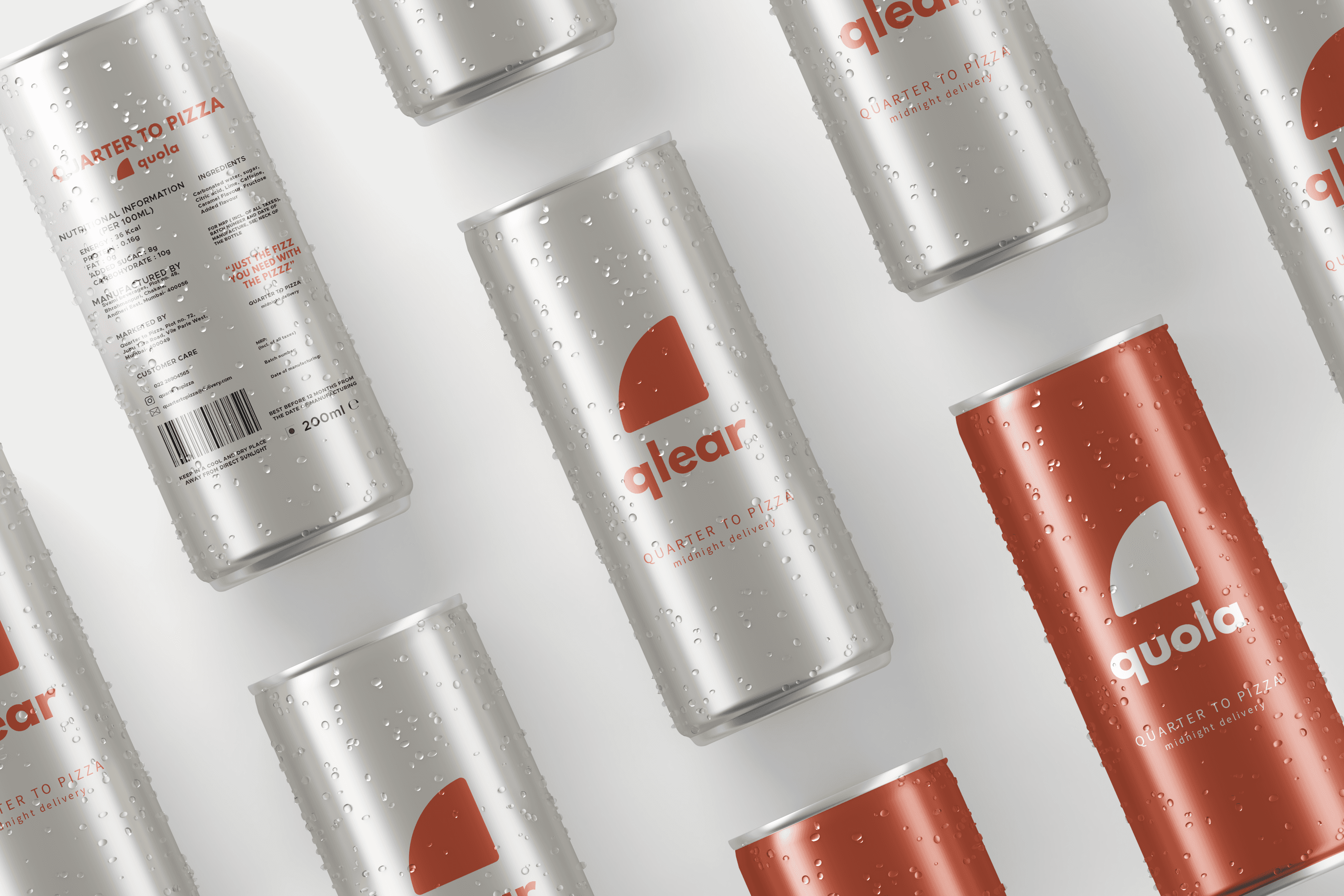

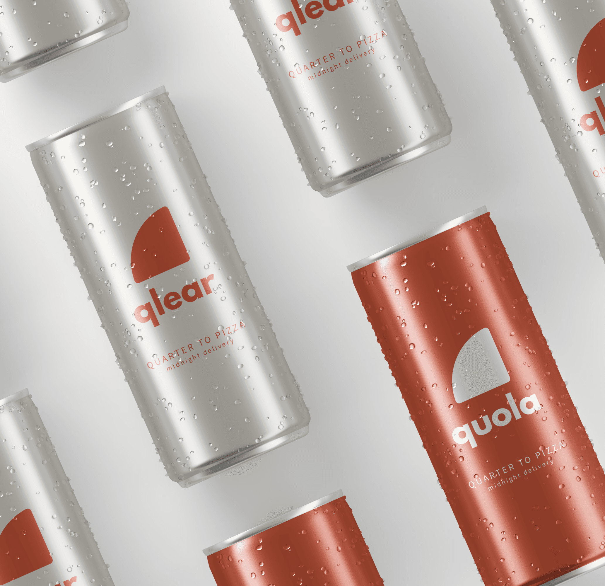
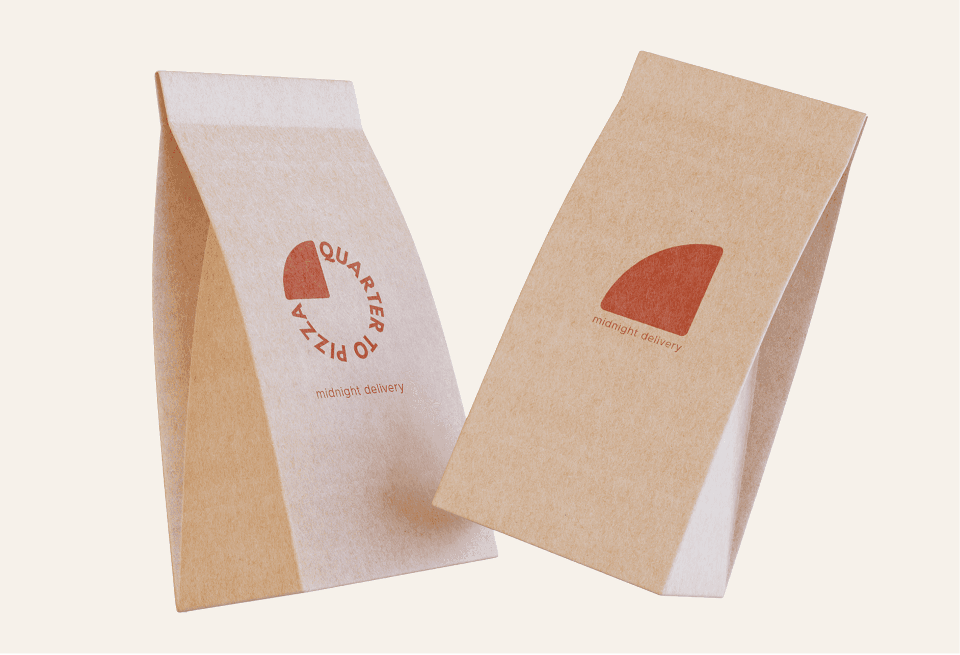



THE LOGO
The logo merges the ideas of food and time into one bold symbol. The circular type mirrors the shape of a pizza, while the filled quarter slice represents both a slice of pizza and the clock striking “quarter to.”
This dual meaning highlights the brand’s unique promise of midnight delivery, making the identity playful, clear, and memorable.


THE COLOUR PALETTE

The colour palette blends warmth and contrast to reflect the brand’s midnight pizza identity. A bold burnt orange captures the heat of the oven and the energy of late-night cravings, while soft beige and off-white tones provide balance and approachability. A deep green accent anchors the palette, adding depth and a hint of mystery that ties back to the after-hours vibe.
THE TYPOGRAPHY

For the logo, we chose League Spartan, a strong and modern sans-serif that’s crisp, bold, and easy to read - ideal for grabbing attention even at a glance. As a secondary typeface, we used Metropolis, which is lighter but still sturdy, bringing contrast while keeping the overall identity clean and straightforward.
Together, the fonts reflect the brand’s late-night, no-fuss personality - direct, memorable, and built for a youthful audience craving midnight pizza.
YOU MAY ALSO LIKE

AKSHITA RATTHA

FOUR TO SCORE